

You must log in or register to comment.
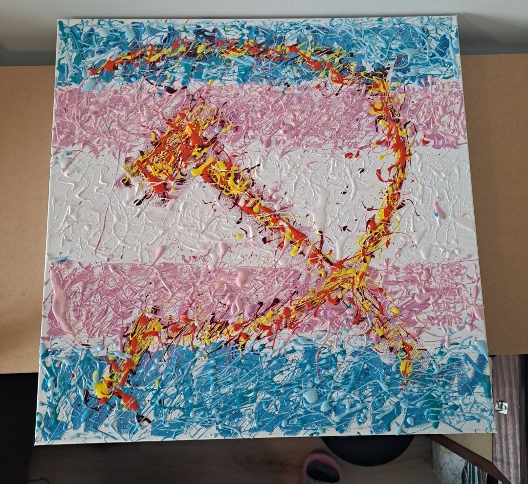
I see what you mean about anti-capitalist art.
😁
I think I get the idea, but I’m not sure the execution speaks to me. The messy paint effect doesn’t feel like it adds as much as with some of the previous ones, and the two obvious visual elements here feel like they could be better integrated in some way (but obviously, whether to care what I think is your choice. Sometimes we just make stuff for the sake of making it, and thats okay)
I look forward to seeing more works :)
Thank you for the criticism! I know exactly what you mean, the two elements dont blend together near as well as I envisioned in my mind, i think the need to keep the flag “readable” really detracts from the messy paint splater effect of both it and the hammer & sickle. I was running out of both paint and medium while making this one so that definitely helps me excuse my poor execution. As much as I love the splater style and abstract expressionism I think I will be going back to landscapes once I can afford more art supplies.
