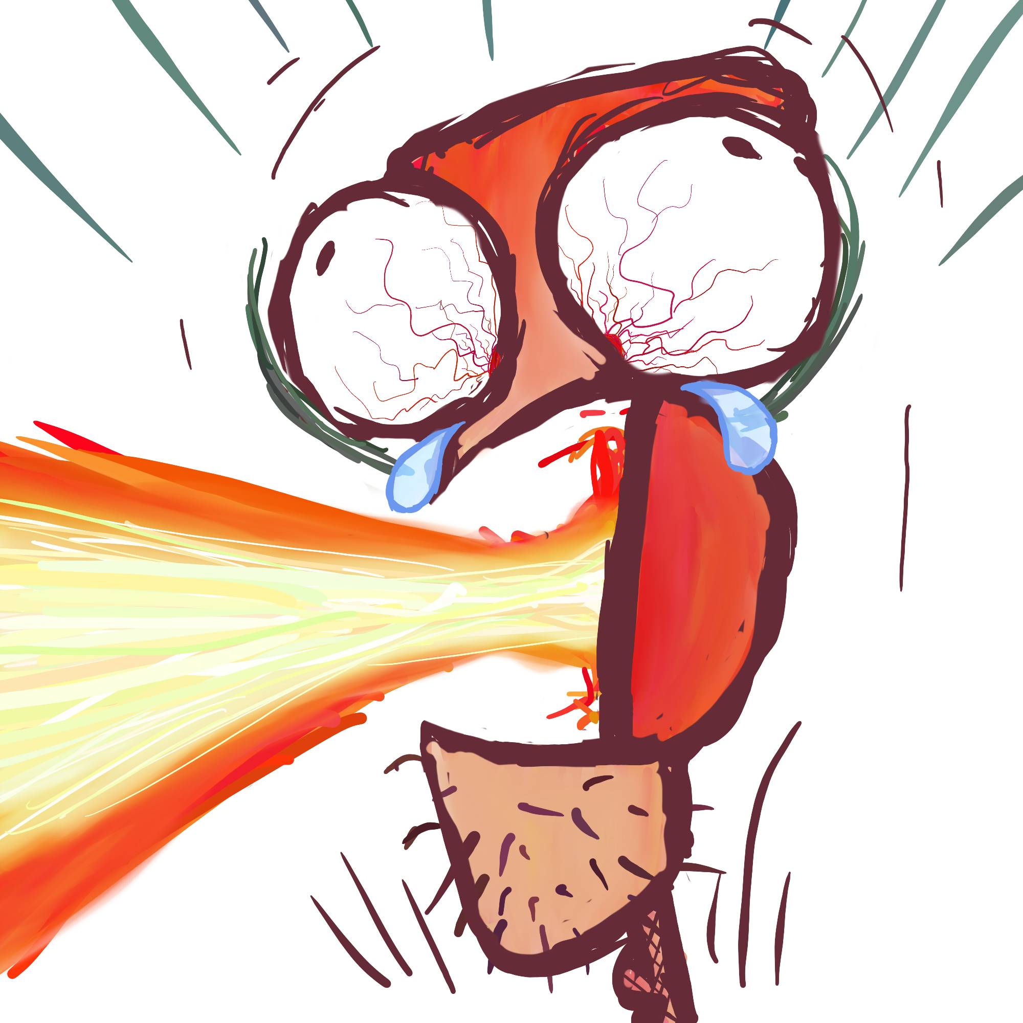
Still working on background. Critiques? I feel like I over did it with the line work…
As for the work of art:
With a fierce yell, he charges forward, gripping the battered axe as blaster fire scorches the air around him. He knows he won’t survive, but with each step, he feels the weight of his fallen friends at his back—this last stand is not for victory, but for vengeance, a final tribute in blood and fire.


I was gonna mention exactly this. Make the background lighter so the character stands out.
Took your advice and others for this revision!
Ditto. Maybe even some red/yellow for contrast, like a fire
Took your advice and others for this revision!
Looks dope!!
Thank you!
Oh that’s a fantastic idea! Would look more like some crap went down too that way. Thank you!
Thank you!