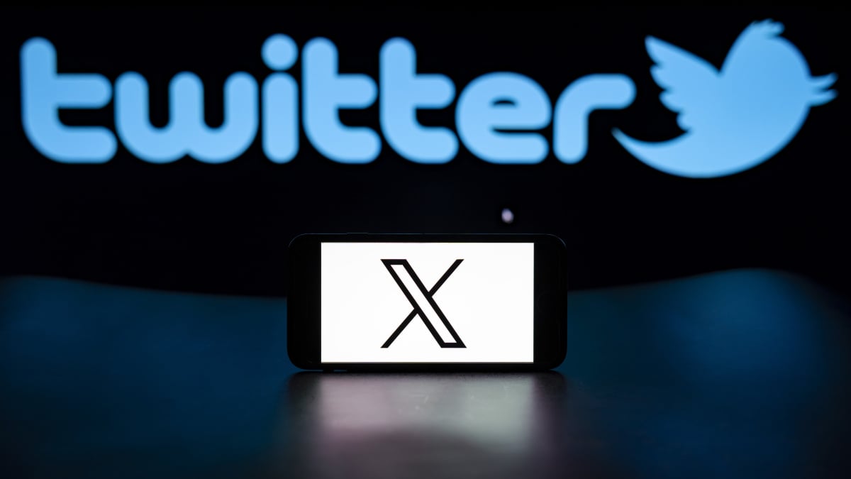
On Monday, it appears X attempted to encourage users to cease referring to it as Twitter and instead adopt the name X. Some users began noticing that posts viewed via X for iOS were changing any references of “Twitter.com” to “X.com” automatically.
If a user typed in “Twitter.com,” they would see “Twitter.com” as they typed it before hitting “Post.” But, after submitting, the platform would show “X.com” in its place on the X for iOS app, without the user’s permission, for everyone viewing the post.
And shortly after this revelation, it became clear that there was another big issue: X was changing anything ending in “Twitter.com” to “X.com.”


X is just a BAAAAAAD brand that it’s almost insulting the people who uses it, honestly were I’m from it sounds like an adult website…
One of the rules of branding is to choose a unique name to prevent confusion. Half the time I see the X logo I don’t know if they’re talking about X11 or the website formerly known as Twitter
Not to mention that from a visual perspective the icon ‘x’ is synonymous with closing or exiting a window. It’s a horrible choice on so many levels.
It’s funny that if you need to clarify X, you can say x11. If you need to clarify X, though, it’s still twitter
Oh, do you mean X the window manager or X the social media website?
The fact that a clarification like that needs to be made shows that Twitter has a branding problem.
Now, tell me which is which:
X is a window system not a window manager. The window manager is a client application that talks to the X server.
Actually it’s refered to Window System/GNU/ Linux
Can’t believe I didn’t catch that. Good catch.
Top left is X11 which means bottom right is Twitter
I think it’s a trick question. Bottom right is https://www.compart.com/en/unicode/U+1D54F
Well you got me curious…
https://www.businessinsider.com/twitter-x-logo-unicode-math-textbooks-2023-7
Can you tell me, in fact?
The first one is X11.
The top left has some design aesthetic to it. Normally I’d assume the logo with the better aesthetics wouldn’t be an open source project logo, but given Musk probably fired anyone that could make a good logo, I’ll assume the more boring one (the lower left one) is the Xitter logo.
Or the XCOM games.
Heh, now as you mentioned, the logos do look very similar.
I immediately thought of the good old Scheiffler and Gettys book: https://m.media-amazon.com/images/I/51YpMj4WSPL._SL500_.jpg
So - a perfectly accurate name for the company then.
I mean… stockX exists too
No worries, it sounds like an adult website pretty universally. There’s three popular porn sites I can think of, which prominently have an X in their name.
My mate sent me a link to a twitter post that had the x.com link and for a moment I legit thought he sent me a porn link by accident.
deleted by creator
Also it’s not really a brand, it’s just a fucking letter of the alphabet. It shouldn’t be possible to trademark letters of the alphabet. Basic decency, people
How about trademarking Alphabet?
Exactly. Believe it or not, someone invented that word at some point in history. And it wasn’t google.
What? It’s just alpha and beta put together.
Ok i see someone of us needs a refresher on the concept of invention
I don’t really have an issue with that. No one else was using it to do business in the tech space, at least.
It’s a hell of a lot better than Facebook just stealing Meta from a company that was actively using it.
https://youtu.be/QDaKTTZtJZY
Elon is a living joke they already made in Futurama.
Here is an alternative Piped link(s):
https://piped.video/QDaKTTZtJZY
Piped is a privacy-respecting open-source alternative frontend to YouTube.
I’m open-source; check me out at GitHub.
It’s like that everywhere. Elon is a fucking idiot.
deleted by creator
It a dumpster fire branding, that they took an extremely long time to actually implement, and they still spit out this absolute trainwreck of a rebranding rollout.